The most useful customer retention metrics, ranked
May 29, 2024


On this page
- 1. Customer retention and churn
- What are customer retention and churn?
- Why are they useful?
- How to you calculate customer retention and churn
- What’s a good customer churn rate?
- 2. Revenue churn rate
- What is revenue churn rate?
- Why is it useful?
- How to calculate revenue churn rate
- What’s a good revenue churn rate?
- 3. DAU/MAU ratio
- What is the DAU/MAU ratio?
- Why is it useful?
- How to calculate your DAU/MAU ratio
- What’s a good DAU/MAU ratio?
- 4. Net Promoter Score (NPS)
- What is NPS?
- Why is it useful?
- How to calculate your NPS
- What’s a good NPS?
- 5. Customer Lifetime Value (CLTV)
- What is CLTV?
- Why is it useful?
- How to calculate your CLTV
- What’s a good CLTV?
- 6. Customer satisfaction score (CSAT)
- What is a CSAT?
- Why is it useful?
- How to calculate your CSAT score
- What’s a good CSAT score?
- 7. Customer Effort Score (CES)
- What is CES?
- Why is it useful?
- How to calculate your CES
- What’s a good CES?
- The problem with NPS, CSAT, and CES
- 8. Feature adoption rate
- What is feature adoption rate?
- Why is it useful?
- How to calculate your feature adoption rate
- What’s a good feature adoption rate?
- Further reading 📖
You put a lot of work into getting people to use your product, but how much work do you put into keeping them?
In this guide we’ll cover the key customer retention metrics, who they’re useful for, and how to calculate them.
We’ve also put together some benchmarks to measure your business against, and tips on how to improve retention.
1. Customer retention and churn
What are customer retention and churn?
These are the two most important retention metrics. Customer retention is a simple measure of how well your business retains customers. Customer churn, often referred to as logo churn, is the inverse: how many customers a business loses.
Measuring monthly retention is best if you run a monthly subscriptions business. If most of your customers pay annually, measure it annually. It's useful to track both if you have a mixture of customers on monthly and annual contracts.
Why are they useful?
Almost any business that relies on repeat customers should be measuring retention and churn. It's a simple, essential measure of company health. Low churn is good, high churn is bad.
Retention is the inverse and shows how sticky new customers are. Do new customers keep coming back for a week? A month? A year? And how often? Drilling down into the data will also help you see which specific features of your product are the most sticky, or the most likely to cause churn.
How to you calculate customer retention and churn
Once you know the timeframe you want to measure, get hold of the following data:
- The number of customers at the start of your timeframe (let’s call this S)
- The number of customers at the end of your timeframe (E)
- The number of new customers added during the timeframe (N)
You can then calculate your customer retention rate by doing a simple sum: ((E − N) ÷ S) x 100.
So, if you start a month with 1,000 customers (S), end it with 1,300 (E), and add 500 new customers (N), then you'd end up with ((1,300 − 500) /1,000) x 100, which equals 80% retention. Your churn rate is just the inverse, 20%.
If this sounds a bit too manual, product analytics tool like PostHog to analyze retention using cohort retention tables.
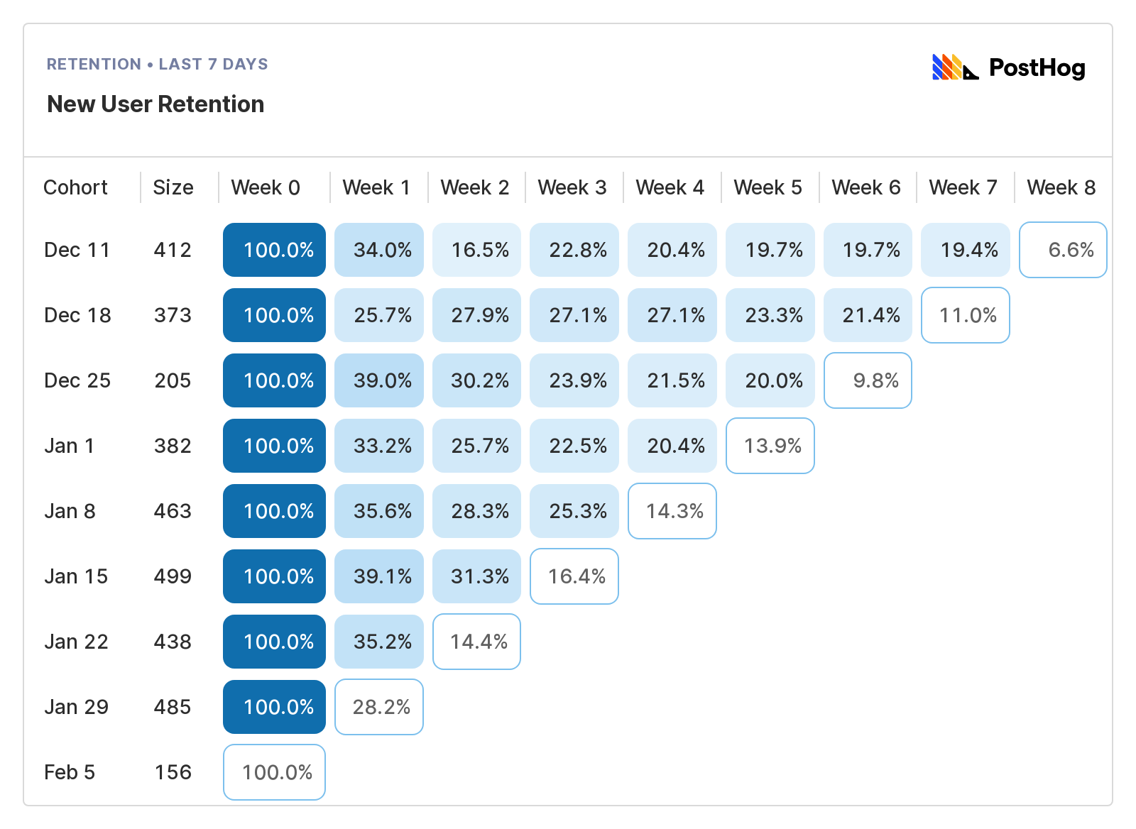
In the example above, we're looking at unique users who signed up to a product for the first time in the last eight weeks, and who then came back and triggered a specific event. To read the data, start on the left and work across:
- Cohort shows the week users signed up.
- Size shows how big the cohort is.
- Week 0 shows the percentage of users in that cohort who used your product in the first week. In Week 0, it's always 100%, then it typically declines over time.
- Week 1 to 8 shows how many users who returned in a given week relative to Week 0. The blue boxes show completed period, the white boxes show periods still in progress.
This table shows that retention out at around 20% from Week 4 onwards, a good sign this product or feature is retaining users. See our guide on measuring retention for a more in-depth look at retention tables.
What’s a good customer churn rate?
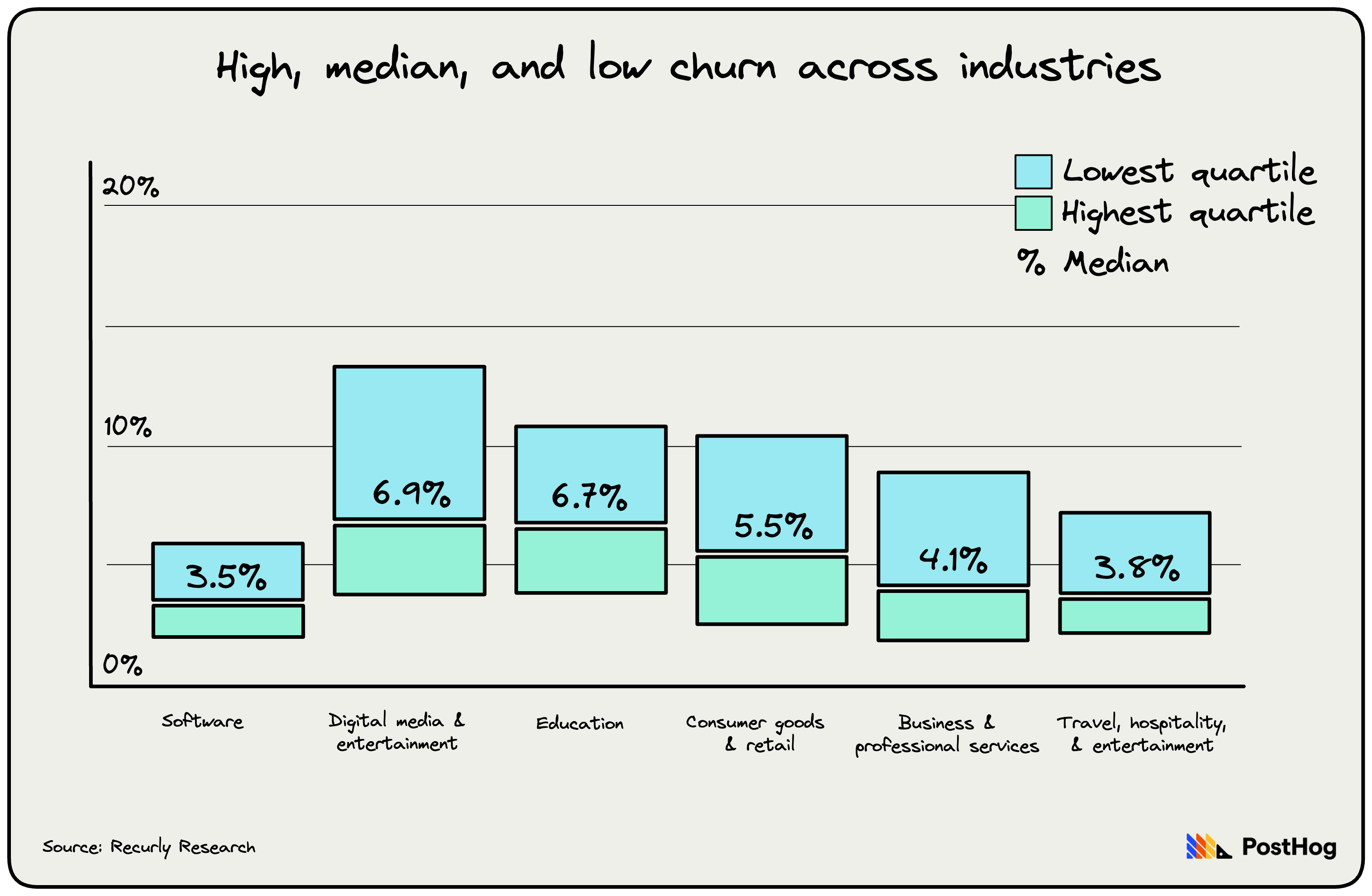
As the above graphic shows, churn rates vary considerably between industries, with software having the lowest churn, and entertainments services the highest.
Most data sets indicate that anything between 3% and 7% is a good churn rate for small to medium-sized SaaS companies that bill monthly, but 8% or more makes growth very hard. Companies that sell to larger enterprises, meanwhile, should aim for something closer to 1%.
Most companies, for obvious reasons, keep churn rates secret. Buffer, which is notoriously transparent, had a monthly churn of 5.42% in March 2024, and an average revenue per user of $27.16 during the same month.
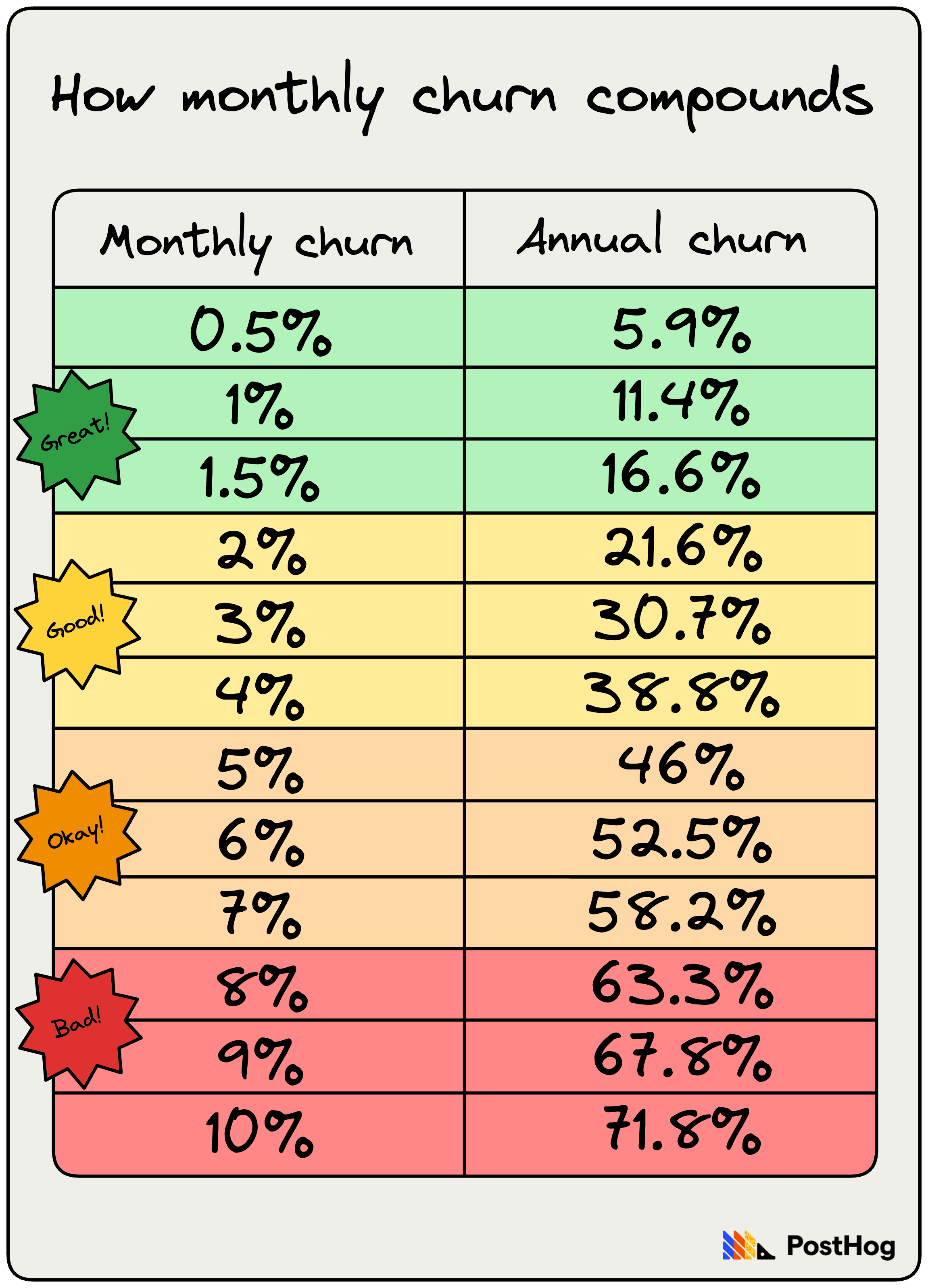
One reason why Netflix continues to dominate the streaming industry is its incredibly low monthly churn. In December 2023 it was just 2%, a figure it maintained for pretty much the whole year. Apple TV+, by comparison, had a monthly churn of 8% in December 2023.
This effectively means that Netflix spends a lot less time and money attracting new subscribers to replace people who’ve left. Apple TV+’s 8% monthly churn might not sound that much higher, but churn compounds. Annually, if Apple TV+ did nothing to attract new subscribers, it would lose almost 80% of its customers. Netflix, on the other hand, would lose 22.1%.
Higher churn at early-stage startups is totally normal and fine, so long as you’re able to grow fast and improve your product. If and when churn slows, that’s a good sign you’ve found product-market fit.
Read our in-depth guide to churn analysis to go deeper on how use these metrics in your business.
2. Revenue churn rate
What is revenue churn rate?
It’s not just customers who churn, revenue churns with them.
While your customer churn rate looks at the number of customers you lose in a given period, revenue churn specifically focuses on the dollar value of recurring revenue lost, or gained, in a certain period.
Why is it useful?
Because it helps you understand how much money your business makes from each user over time, and the impact of customer churn on revenue.
Not all revenue churn comes from customers failing to renew, or cancelling their contract. It can also come from customers downgrading their subscription, or using your product less.
This is really useful for understanding the exact nature of retention and churn in your product. A company, for example, could have a low customer churn rate, but high revenue churn. This would suggest either:
- Only high-value customers are churning.
- Customers are choosing to spend less or downgrade, rather than churn entirely.
Analyzing customer retention and revenue churn together is essential to finding the truth about your business.
How to calculate revenue churn rate
You can calculate your revenue churn rate based on either gross or net revenue:
Gross revenue is simpler but less useful, as it’ll show you how much revenue is churning out of your business without much context.
Net revenue is harder to calculate, but way more powerful because it'll show both the amount of revenue lost from, say, customers downgrading, but also the revenue gained from customers upgrading.
To calculate gross revenue churn rate, take your churned revenue in a month and divide it by the monthly recurring revenue (MRR) from the previous month, and multiply that total by 100.
For example, Hogflix, a streaming platform for hedgehogs, had an MRR of $100,000 in May. In April, its churned revenue was $17,000. Divide $17,000 by $100,000 to get 0.17, then multiply that by 100. Voila, Hogflix has a gross revenue churn rate of 17%.
To calculate net revenue churn, find your churned revenue in a period and subtract your expansion revenue, and divide that total by your monthly recurring revenue in the previous period. Now multiply that new total by 100.
For example, Hogflix had MRR of $100,000 in May. In April, its churned revenue was $17,000 and its expansion revenue was $3,000. So, subtract $3,000 from $17,000 to get $15,000 and divide that by $100,000 to get 0.15. Multiply that by 100 to get 15%.
What’s a good revenue churn rate?
This depends again on how much your customers pay and how often they pay. If your business is based on monthly subscriptions, and your average revenue per account is $10 or less per month, then aim for monthly net revenue churn of around 6% or less.
The more customers pay, the lower your churn should be. At $250 average revenue per account per month, aim for a net revenue churn of 1.4% or less, according to data compiled by analytics platform ChartMogul. This sort of churn rate also assumes that your customers are paying annually and, therefore, churn less often because they can’t ditch their contract.
Somewhat confusingly, it can be a good thing when net revenue retention, or NRR, is negative. This relies on something called net negative churn, which is when the revenue gained from existing customers through upselling and upgrades compensates for revenue lost from churn. Basically, revenue from existing customers is expanding faster than revenue lost from losing customers.
For a lot of SaaS business this can be a sign of high customer satisfaction and strong product-market fit. Making more revenue from existing customers is also cheaper than acquiring new ones, especially if they then churn. Despite this, it's important not to neglect acquiring new customers, and a high churn rate is likely still a sign of issues with your product or your marketing strategy.
3. DAU/MAU ratio
What is the DAU/MAU ratio?
It’s the ratio of daily active users over monthly active users. This engagement metric measures stickiness and shows the percentage of your users who are using your product every day. If you’ve got a high DAU/MAU ratio, then people are returning to your product often. While these aren’t strictly user retention metrics, proactively addressing unexpected drops in active users or user engagement can give you more evidence of what’s working and what’s not.
Why is it useful?
This is the big one for social media platforms and online and mobile games. Basically any businesses with products or services that are meant to keep people hooked should be paying very close attention to their DAU/MAU ratio.
How to calculate your DAU/MAU ratio
Simply divide your daily active users by your monthly active users. To get a percentage, multiply the total by 100. For example, say HogFlix has 1,000 DAUs and 4,000 MAUs. Divide 1,000 by 4,000 to get 0.25. Multiply that by 25%. This means that 25% of Hogflix’s monthly active users are using the product every day.
What’s a good DAU/MAU ratio?
This metric was popularized by Facebook before it became Meta and is an important measure of success for online platforms big and small.
As of March 2023 Facebook had a DAU/MAU ratio of around 68%. That’s very good. In Q1 2023, Snapchat had a DAU/MAU of around 51%. Public companies almost always publish daily and monthly active users in their financial reports, so finding this data is often quite easy.
Want to go in-depth on DAU/MAU ratio? Check out our guide.


Subscribe to our newsletter
Product for Engineers
Helping engineers and founders flex their product muscles
We'll share your email with Substack
4. Net Promoter Score (NPS)
What is NPS?
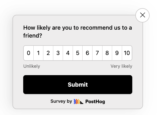
Developed in the early-2000s and popularized by an article in Harvard Business Review, the Net Promoter Score continues to be a very popular way of measuring customer loyalty. It’s based on one question: ‘How likely are you to recommend [company/product/service] to a friend or colleague on a scale of 0 to 10?’Customers are then put into one of three buckets.
- Promoters, who gave a score of 9 or 10, are loyal enthusiasts and very likely to recommend you.
- Passives, who gave a score of 7 or 8, aren’t super happy or unhappy but are also unlikely to promote your business.
- Detractors, those who rated you between 0 and 6, could potentially damage your business through word-of-mouth.
As you might imagine from a metric that relies on people answering a single question, the NPS is both alluring and shaky. Alluring because, amongst a sea of often confusing data points it can seemingly provide clarity. But shaky because, well, a single data point isn’t enough to go on. As a result, it’s important to combine it with other metrics to really understand what’s going on.
Why is it useful?
Because it's an easy-to-understand, qualitative indicator of retention, and a simple way of measuring whether the changes you're making to your product to improve retention will be successful. If your NPS improve over time you can be reasonably confident retention should improve as well.
That said, this isn’t the most useful metric for very early-stage startups. NPS relies on having a large number of established customers to provide meaningful data, and scores from new users are less reliable than those from people who have been using your product for a long time.
How to calculate your NPS
The NPS score is calculated by subtracting the percentage of Detractors from the percentage of Promoters. For example, if 80% of your customers were promoters and 5% detractors, your NPS score would be 75. Anything above 0 is good, above 20 is great, and above 50 is very good.
What’s a good NPS?
According to Satmetrix, the average NPS score for software and apps is 27. But there’s a really wide range – at Dropbox, it’s 27, at Slack it’s 53, and at Square it’s 70. At PostHog, the NPS for our product analytics is 46.7, for our session replay it’s 56.6, and for feature flags it’s 65.9.
Below is a table with a benchmark of NPS scores from well-known SaaS products.
| Product | NPS score |
|---|---|
| Snowflake | 72 |
| Square | 70 |
| Zoom | 69 |
| DocuSign | 66 |
| Zapier | 64 |
| Slack | 53 |
| Mailchimp | 47 |
| Netflix | 46 |
| Twilio | 34 |
| Dropbox | 27 |
5. Customer Lifetime Value (CLTV)
What is CLTV?
Also known as LTV, this metric looks at an entire customer journey, combining repeat purchases, upsells, and potential future revenue.
While it’s not a direct measure of customer retention or churn, things that reduce churn almost always lead to higher CLTV, making it a useful proxy to confirm you're making progress.
Why is it useful?
This is another really important metric for subscription-based businesses, such as SaaS products and online services, especially those where the value of individual customers varies.
A strong understanding of CLTV will help identify high-value customers and how they behave. You can then, for example, work to move more people into that cohort, or work out how to better serve your most loyal customers.
How to calculate your CLTV
Take the average revenue per user (ARPU) within a specific timeframe, say monthly or annually, and multiply it by your average customer lifespan.
For example, if your ARPU is $50 per month and your average customer lifespan is 12 months, then your CLTV would be $50 x 12, or $600.
What’s a good CLTV?
To work this out you need to know your CAC. That’s your customer acquisition cost, or, simply put, the average cost to your business of snagging a new paying customer. If your CAC is lower than your CLTV then you’ve got a healthy business that’s able to acquire new paying customers without losing money. If it’s not, you're in trouble.
As a guide, at early-stage startups the CLTV might be lower as you acquire new customers and find product-market fit. According to data compiled by search optimization firm First Page Sage, the average CLTC to CAC ratio at B2B SaaS companies is 4:1. At B2C SaaS companies, it’s 2.5:1.
And this kind of healthiness compounds: acquiring customers without spending a ton on marketing allows you to focus more on improving and expanding your existing product, delighting your most loyal customers, and improving overall customer satisfaction.
6. Customer satisfaction score (CSAT)
What is a CSAT?
Your customer satisfaction score, or CSAT, is similar to your NPS, but is specifically a great customer retention metric to use before you’ve found product-market fit. Satisfaction tends to be short-lived, whereas loyalty takes time to build. And that’s why CSAT is a great metric for early-stage startups.
Why is it useful?
Any businesses that interact in a very direct, tangible way with customers on a regular basis should be measuring their CSAT: think customer support, for example. On the flipside, businesses that rely on very transactional relationships with customers, such as online retailers, or high-value, single-purchase businesses should place higher importance on other metrics.
How to calculate your CSAT score
Again, ask a straightforward question: ‘How satisfied are you with our product?’ and give people a range from 0 to 10 or 0 to 5. You should collect CSAT responses right after someone uses a specific feature.

Here’s the math. Positive responses sit in the range of 4 to 5 if your scale is from 1 to 5 and 8, 9, or 10 if your scale is from 1 to 10. Your CSAT score is the total number of positive responses divided by the total number of responses. So if you survey 100 people and 80 people give you a positive score that’s a CSAT score of 80%.
What’s a good CSAT score?
A good CSAT score is typically between 75% to 85%. According to Fullview, the average CSAT score for SaaS companies is 78%.
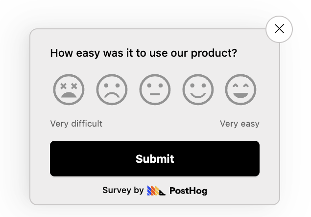
7. Customer Effort Score (CES)
What is CES?
Your customer effort score, or CES, is a measure of how easy, or not, your product is to use. This is a crucial metric if "ease of use", rather than features, is the main differentiator between your product and your competition.
Why is it useful?
This is something of a leading indicator: a low CES score suggests you will probably have low retention because your product is hard to use – unless, miraculously, people are using it in spite of it being badly designed.
As such, this is a good metric to measure at a startup once you’ve found product-market fit.
How to calculate your CES
It’s a similar process to NPS and CSAT, but with a slightly different question: ‘How easy was it to use our product?’ Give people a scale of 0 to 5 or 0 to 10. Your CES score is then the sum of all responses divided by the number of responses. So if you survey 100 people, and the sum of all their responses is 350, then your CES score is 3.5.
What’s a good CES?
The definition of a ‘good’ CES score varies between companies and industries. On a scale of 1 to 10, anything above 7 is good. On a scale of 0 to 5, anything 4 and above is good. In both instances, anything below shows either that there’s some room for improvement or, for very low scores, that something is badly wrong.
The problem with NPS, CSAT, and CES
These metrics, and other similar single-question retention metrics, only give you a snapshot. A low CES score would suggest people are finding your product, or a feature of it, hard to use. But you won’t know why or how to fix it.
Similarly, a low or high CSAT score doesn’t tell you how likely you are to retain a user. They could leave because of pricing, for example. Dig deeper through surveys, session replays, and user interviews to find the real pain points and the things that spark joy.
See our guide to NPS, CSAT and CES surveys for a more in-depth look at how ot use them.
8. Feature adoption rate
What is feature adoption rate?
This is actually a whole group of metrics for all the different features of your product. Feature adoption rates measure the percentage of users who, as the name suggests, use certain features. Let’s say you’ve invested a lot of time and money developing a new product feature. Wouldn’t it suck if nobody used it? This customer retention metric helps you understand the most popular features of your product, and the ones that not many people use.
Why is it useful?
This is a super useful retention metric for SaaS companies, both B2C and B2B, and particularly businesses with both free and premium tiers. A good understanding of feature adoption rate will help you see which premium features are most-used, for example. On the flipside, e-commerce services, which broadly speaking have one ‘feature’, should focus on other retention metrics.
How to calculate your feature adoption rate
The formula for working this out is simple: take the number of users of a specific feature in the last month and divide it by the total number of product users, then multiply that total by 100.
You can quickly get pretty granular here and pull out some really useful information. Combine this kind of analysis with, say, user segmentation, and you can see which segments love which features.
What’s a good feature adoption rate?
This one is hard to benchmark as the variation between features and companies is vast. An analysis by Pendo found that a “best in class” feature adoption rate amongst B2B SaaS companies was 28%.
Further reading 📖
An engineer’s guide to talking to users: The best way to fix poor retention is to build a better product, and to do that you need to talk to your users. This guide is for engineers, but the lessons are universal.
A software engineer's guide to A/B testing: Want to test new features to improve retention? Start here.
Subscribe to our newsletter
Product for Engineers
Helping engineers and founders flex their product muscles
We'll share your email with Substack